
“Mobile is becoming not only the new digital hub but also the bridge to the physical world. That’s why mobile will affect more than just your digital operations – it will transform your entire business.” Thomas Husson, Vice President & Principal Analyst at Forrester Research
In recent days, mobile is becoming an integral part of everyone’s lives. Even we can see it is like another organ of an individual.
What Does Mean by Mobile-Friendly?
Mobile-friendly means, your website/application should be visible good enough in the mobile screens as well as functional. In simple words, it should show the different menu styles and the page elements with scrollable and accessible. The website/application looks similar in all of the devices without any usability glitches. It may not be fancy but it gives a simple and consistent experience in desktop as well as in mobile devices.
Why Should We do Mobile-Friendly Test?
Mobile phone user penetration worldwide reached 67% in 2019. (Source: DataReportal)
According to mobile device usage statistics in 2018, the number of mobile phone internet users in the United States is estimated to increase from 237 million in 2017 to 275 million by 2022.

If your website is not mobile-friendly, then it will be difficult to access in mobiles. The user has to zoom the image to see it better and read the content. It makes the user getting frustrated. So, it is essential to conduct testing to deliver mobile-friendly sites. When your website is designed mobile-friendly, the end-users will get a better experience. The below picture shows the representation of how the mobile-friendly website looks and how it should not be.
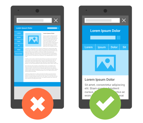
Image Source: https://developers.google.com/search/mobile-sites/
How Should We Conduct Mobile-Friendly Tests?
Testing the mobile-friendly tests manually in multiple devices and confirming consumes the team’s time. The basic level of mobile-friendly testing should be done manually before conduct testing with the tool. They are:
- Usability
- User Experience
- Core Business workflow
Usability
When testing for usability, we need to focus on and ensure how easy the website is accessible.
User Experience
When testing for user experience, how a person felt using the website. Simply, we need to focus on how the user is able to interact with the website elements without any hindrances.
Business workflow
Testing the business workflow is vital to confirm the core business workflow is working without any functional issues. For example, in the eCommerce website, the core workflow is able to do the shopping and placing an order.
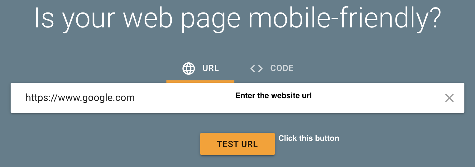
After checking these 3 basic points we need to test the other aspects. Google has an online tool mobile-friendly to confirm your site is mobile-friendly or not be a savior for us. I personally liked this tool a lot and handy to save my time to test the mobile-friendliness with the necessary results. It can be tested by merely entering the website URL and Click the TEST URL button. The screen looks like the below snapshot:
After testing it will show the test results as the requested URL is mobile-friendly or not. The result will look like the below snapshot:
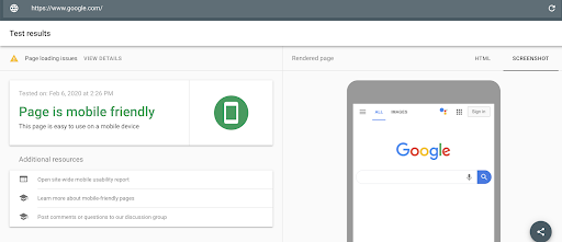
This test result also has an option to share with your team with a URL.
Apart from this tool, a few other tools also available to check mobile-friendly. The tools are Rank watch’s mobile-friendly-check, Bing’s Mobile Friendliness Test Tool, Pingdom and W3C’s MobileOK Checker, etc.
I hope this blog helps to understand the importance of having a mobile-friendly website and how to conduct mobile-friendly tests.


