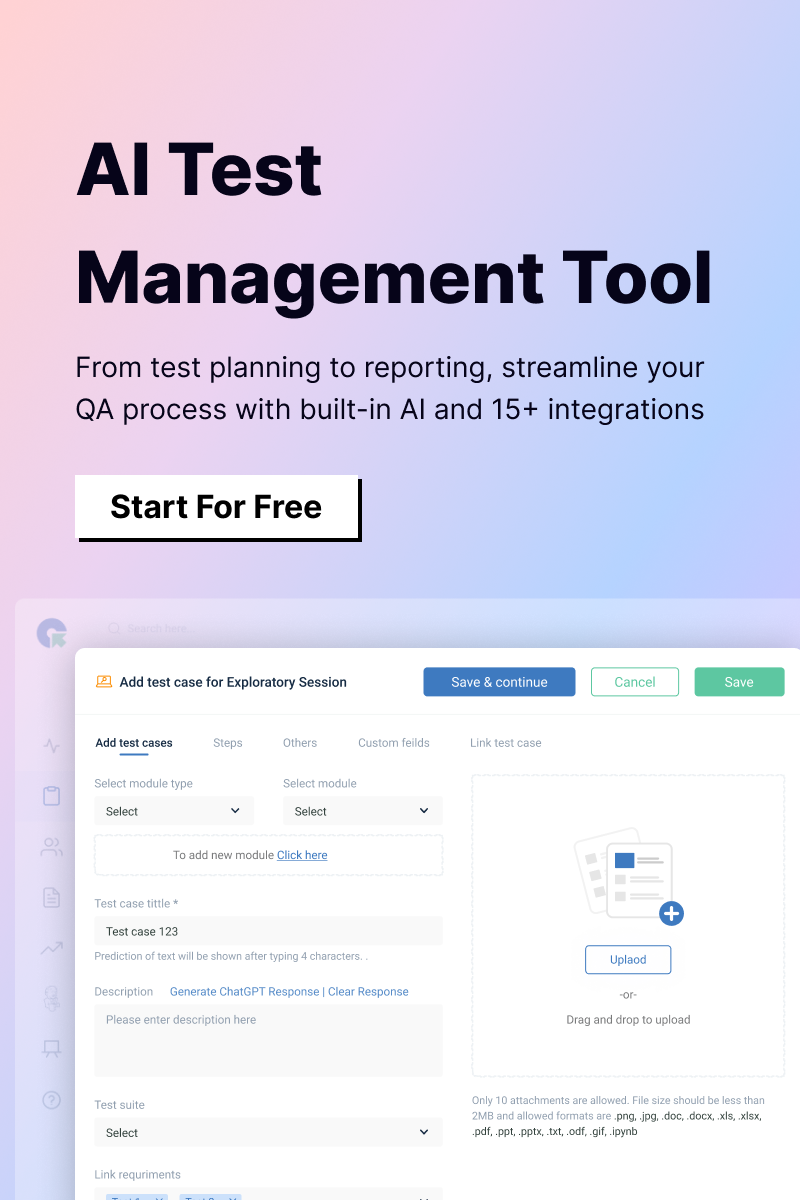
Before we start about what is Mobile App UI Testing here are a few things you need to know. UI is an important aspect of your mobile application. There is much demand within the team to make sure you put up the best UI possible. When testing the UI on mobile applications various aspects need focus, consideration, and verification. In this blog, you’ll learn what are those characteristics or elements that need to be verified. Let’s get started!
1. Screen Resolution
These are some of the commonly used screen resolutions that are considered while creating testbeds:
640 × 480
800 × 600
1024 × 768
1280 × 800
1366 × 768
1400 × 900
1680 × 1050
All of the above-mentioned resolutions are mandatory to go through testing when there is a multi-column layout in your mobile application.
The verification can be done starting from the smallest to the biggest resolution in the table above. Aside from these, if the app has a big list of cards loaded with important data or information then those also need to be tested on every resolution, this is to ensure their information wrapping.
2. Screen Size
Right now there are several different screen sizes available in the market. When we talk about smart devices specifically, controls sizes are not static.
When testing, you should make sure that the control’s size look please and esthetically good. Also, the controls should be properly visible without any need to scroll. You’ll have to test GUI on several devices with various screen sizes and resolutions.
In these cases, Emulators are a perfect choice. However, nothing matches the real device so you’ll have to ensure to test at least 2 or perhaps 3 real devices. Additionally, also test on landscape and portrait directions if the device supports it. Test the application under commonly used resolutions to ensure the best usability.
3. Different UI Elements
The UI aspects like buttons, headings, images, icons, text fields, checkboxes, etc are required to be verified of their appearance and size on the display screen.
Especially for the text fields, if the soft keyboard displays on the screen just by a tap in the text field r not and this aspect has to be tested and verified.
The testing of button sizes is required, let’s say a customer is willing to add things to their cart but unable to do so because the button is too small. You are losing potential customers. They’ll most probably abandon the website for sure.

As important as the testing, the position of different UI elements should be verified against the requirements things like, all the text has to be center-aligned or left-aligned or right-aligned.
4. Style: Color and Theme Scheme of the Device
Your App’s UI, the color scheme should be consistent throughout the app and must align with the phone/device as well. For your information, the color theme of a Samsung phone is different from that of Nokia and MI or more.
All this is to say that you’ll have to verify if the app is looking very consistent across all the devices.
Your application must have its own design.
And so the style of the controls has to also match with that design. However all these won’t affect the usability or functionality of your app, you need to maintain a consistent design discipline within the app. Because it helps you build an app that’s more user-friendly and please at the same time.
One of the very important aspects of style is the font of the different pages. So, the font should be tested well to safeguard from any forms of inconsistency in the look or feel of the design and even the application as a whole.
Well, most of the time we end up focusing more on the text that’s visible right on the screen and ignore what will appear in certain instances. For example success and failure prompt messages. Don’t avoid them even they are crucial.
Another factor that is vital in terms of style is the relation between the font color, a circumstance in which the text is displayed.
For instance, Red color should be used to prompt an error message. Green color must be used to indicate success. Yellow color should be used to indicate warnings. And lastly, blue should be used for hyperlinks.
5. Multi-touch or Single touch
In case your app supports the multi-touch feature like pinch to zoom or shirt or more, then you should meticulously check this feature. Apart from that also cerate as many test cases as possible for this in all applicable screens.
6. Long or Short Press
Notably, a long press on an icon would show the context menu whereas the short touch performs the first action of the menu. If in case you have this feature in your app then you need to test and verify all the functionalities in and around it.
7. Location
The term location is used to determine and describe the following scenarios: Sometimes it’s called the area on the screen where you can see the controls.
For instance: The header banner is located on the top, labels are located on the left side. Or the textboxes are right-aligned etc.
At times it is used to describe an order of control among the other controls.
For example, when collecting personal information the app might also require the user to enter the location or zip code.
For both of the above-mentioned situations, we are talking about the location of the controls.
When testing for the location and position of controls, you’ll have to keenly make sure that everything is logically placed on the screen.
Those are our final thoughts and will leave you here. More interesting blogs are coming your way every Tuesday! And further, if you like the type of content you are reading, be sure to subscribe to our QA Touch blog posts for more interesting content. We create and send so much Testing joy to your inbox without making a noise. Also, give us a thumbs-up on social media, where we do all the fun and exciting content on Testing and Tech.